From Priorities to Collaboration: Why Visualization Matters
Written by BACKND Product Manager, Whaley, 18 June 2025
We Need to Choose What Matters Most
There is so much we want to do. Every single BACKND customer matters deeply to us. We want to lift each of them higher. It is hard for us to overlook even the smallest inconvenience we notice, and every VOC feels like something we need to fix right now. But our available resources are limited.If we try to fix everything in sight, we might end up with a "+20 fully enchanted wooden stick" shiny but useless.
We need to know what truly matters and pour our energy there. On top of core tasks, we’re hit with leader mandates we “absolutely MUST do,” business team requests tagged “final_final_REAL_IMPORTANT_v3,” customer complaints, personal side quests, shiny new tech, and of course—our favorite—technical debt.
All of this stacks up like an endless buffet of to-dos. We have to pick the more important stuff. Do it sooner, faster, sharper. Don’t spend all your time choosing but sometimes doing is more important than thinking. One way or another, we must choose. The more, the more-er, the most important thing of all!
This isn’t a struggle unique to the BACKND team. When everything feels like a shiny pearl, we’re left picking through the pile. What’s truly important, what’s cost-effective, and what can realistically get done before lunchtime. And even then, we’re still trying to filter out only the most essential of the essentials.
This magical thing we call “prioritization” is something we at BACKND have wrestled with for a long time. We were trying to identify it, agree on it, and take action on it together. Today, we’d like to share a bit of our journey with those of you who may be in the same boat: how we tried to build a 'Priority-driven collaboration culture.'
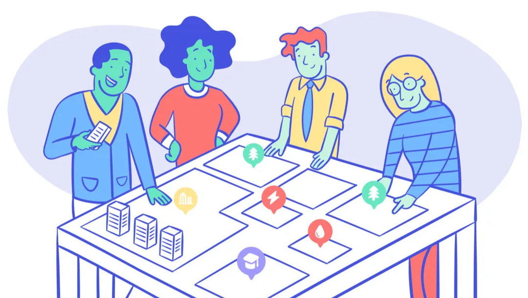
To build such a culture, we believe it requires going through four steps: Visualization → Alignment → Connection → Evaluation.
- Visualization: Making the purpose and progress of every task clearly visible
- Alignment: Making sure everyone is on the same page about what comes first
- Connection: Executing without missing a beat and driving toward results
- Evaluation: Checking if we hit the goal and adjusting if we didn’t
1.Visualization
2.Connection
3.Alignment
4.Evaluation
*** This isn’t some off-the-shelf framework. These steps were defined after deeply analyzing our specific context and conducting interviews with BACKND team members.***
Today, let’s talk about the first step: Visualization
Visualization: Making the purpose and progress of every task clearly visible
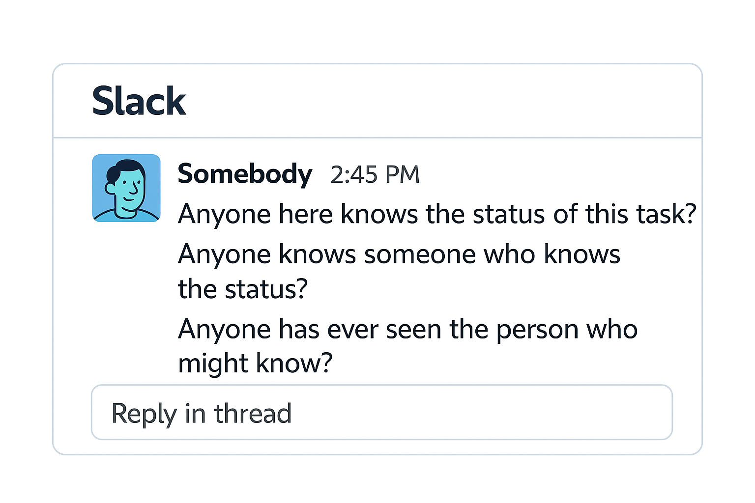
Alfred Hitchcock, the master of suspense, once said: “Suspense is when the spectator knows more than the characters.” (Interview in 1970)
Imagine four people sitting at a table, playing poker. Just before the game starts, we (here is the audience) see someone place a time bomb under the table. Now we’re on edge, gripping our seats, thinking: “Forget the poker! That thing’s about to blow!”
Oddly enough, the workplace is often just like this. Someone knows there’s a “bomb” under the table. Someone else has no clue. Another person thinks, “Well, I’ve got my own problems, who cares about a bomb?” And if it does explode? You’ll hear a chorus of “I didn’t know,” “I knew, but I was told to clean my desk first,” “Who said that?”, “How could you not know?”, “Didn’t they say it wouldn’t go off?”, and “Well, at least my desk is spotless.”🎵
All of this chaos stems from one thing: information gaps. These gaps tangle up decision-making and quietly amplify everyone’s anxiety.
That’s why visualization had to be our first move in building a priority-driven work culture. We needed to make sure that no one is left guessing that all the “bombs” and hidden details are brought up onto the table, visible for everyone. Only then can we collectively know: what truly matters.
At BACKND, we were already using Jira and Notion and holding regular team meetings. So, in theory, people had access to each team’s task status. But in practice, it wasn’t always clear what was actively in progress, what was coming next, when something would be done, or what issues might delay it. Someone probably knew but if they didn’t share it, then no one else would.
As we analyzed each team member’s tasks and conducted interviews across teams, we found that the core issue lay in how people defined a “task.” Everyone was operating with a different unit of work. Some approached it from a customer delivery perspective, others from individual assignments, and some from a team-level view.
To make matters more complex, BACKND is a technically-oriented organization that provides development environments to other developers. Many of our tasks are infrastructure or backend-related, which don’t naturally align with business-facing units. While it's possible to understand where a task fits through conversations, that method has its limits. From executives to frontline staff, from business to dev teams and even our Customer Growth team, there needed to be a shared understanding of what each unit of work actually meant.
The second issue was that these tasks were tracked in entirely different documents. At BACKND, teams used their own preferred tools—Kanban boards, timelines, Notion pages, based on individual efficiency. But there wasn’t a “single source of truth” where the overall project status could be verified at any time. This naturally increased reliance on PMs who understood the full picture, and it led to repeated communication costs.
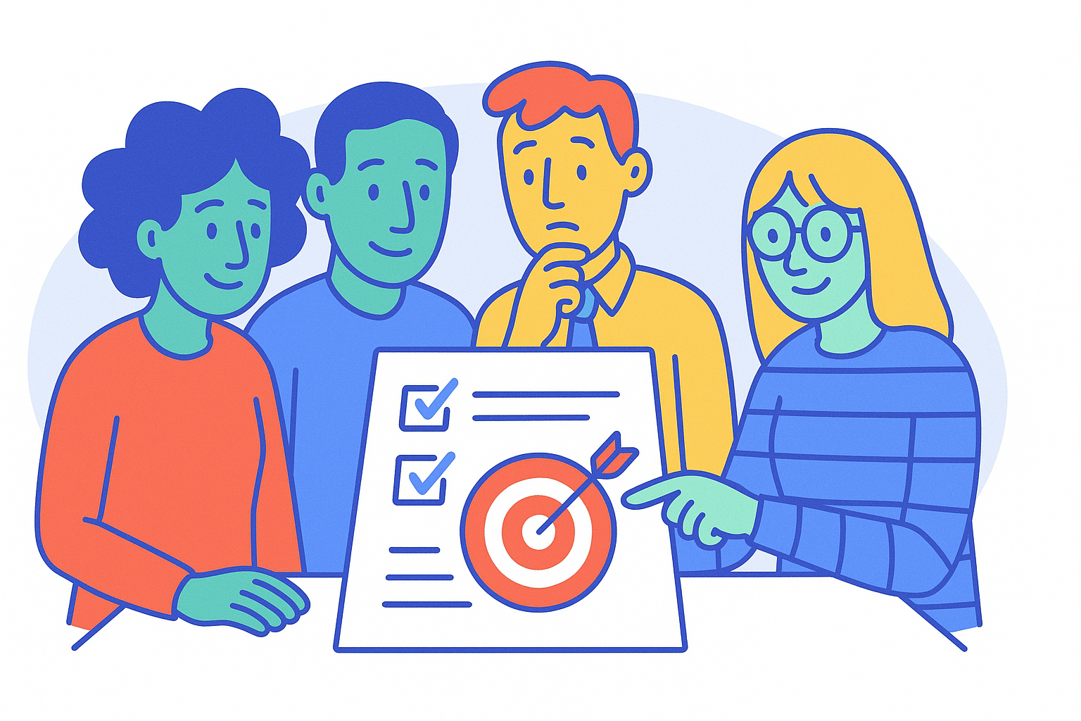
The mission was clear: Define tasks in the same unit, Look at the same map.
Look at tasks in the same unit 🗣️
: Restructure scattered epics and tasks across Chapters under a common rule
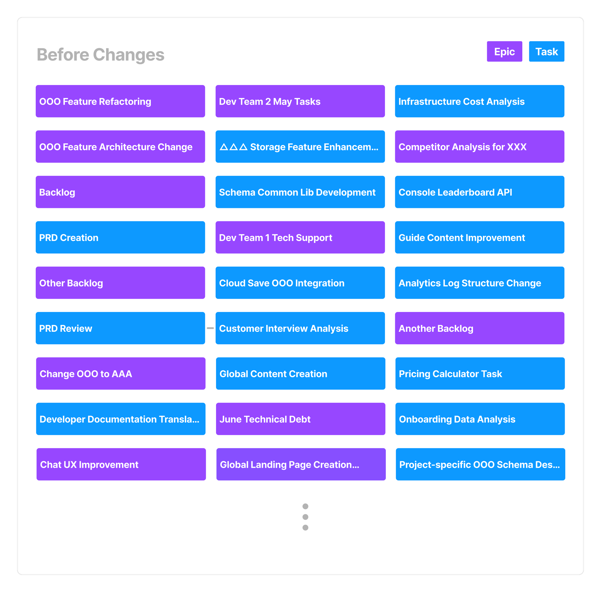
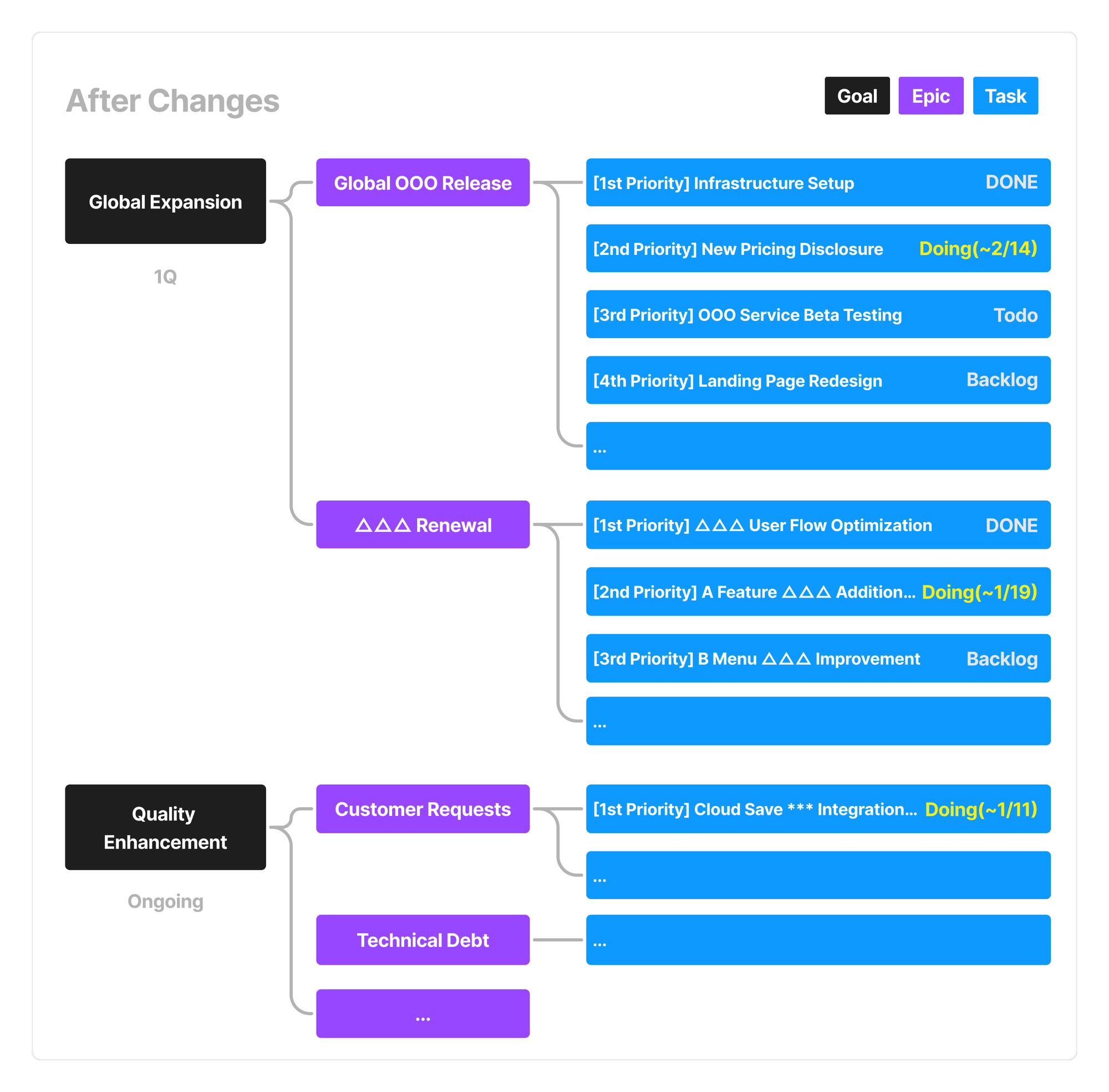
- The first step was redefining the standard for “ongoing tasks” (or stories) from a customer delivery perspective. We adjusted our timelines so that the task completion date directly translated to a delivery or release date. Each Chapter’s internal tasks were handled using subtasks. For instance, individual jobs like “writing the PRD,” “developing the condition-saving feature,” and “developing the console API” were grouped under a higher-level task: “Enable users to save search conditions.”
- Next, we grouped scattered tickets by purpose. We merged the main epics that were divided by chapter into unified epics so we could track them more easily. Then, we sorted all tasks into categories based on intent, such as customer requests, technical support, technical debt, data analysis, and general improvements. Tickets from each chapter were assigned to one of these groups. During this process, outdated or already completed tickets were boldly removed from view.
As a result, we were finally able to see the status of every task and our backlog using a shared unit of reference.
If we were to visualize the before and after, it would look something like this:
[As-is]
[To-be]
Look at the Same Map 🗺️
: Provide a single shared Notion database accessible to all members
Now that we’d standardized the unit of tasks, the next step was deciding where to see them. We had tried building various Jira dashboards for different purposes, but that approach had its limits. Because not all teams actively used Jira, depending on the nature of their work. Fortunately, Notion was already being used across all teams in a consistent way.
We decided to sync key information from Jira into a centralized Notion database. This allowed us to view ticket titles, due dates, priorities and end up with all them within Notion. When needed, additional notes or discussions could be added in separate fields for each task.
💡 How we use Notion:
Epic, Task, Priority, and Due Date are synced from Jira,
while discussions and updates are maintained in the “Progress” field.
Communicating based on Jira data but through Notion turned out to be especially useful for the next step, "Alignment", and has remained an effective method for us to this day.
Retrospective Myself: What Should Come Before Change? 📝
So far, we’ve explored the first step of building a priority-driven work culture "visualization." To wrap up, let me share a light retrospective, a little off-topic but worth mentioning.
I believe one key reason this effort was successful is because the changes happened gradually over three months. BACKND team members are constantly running full speed in all directions, so a sudden, drastic shift could have made more important work harder to accomplish.
That’s why, before diving into action, we first interviewed our “customers (our team members)." From that, we learned that gradual, non-disruptive change was essential. And thanks to that, our visualization process landed smoothly across the team. (And to everyone who took time out of their busy days to share feedback and adapt to the new system! Thank you again! ❤️)
This experience also reminded us of something important when it comes to improving BACKND’s product. For customers who are used to the current system, “change” can feel confusing before it feels good or bad. So before introducing any change, the first thing we must always do is remember the people who will experience it. This entire visualization effort was a reminder of that basic but often overlooked principle: Every change should begin by understanding the people who need to embrace it.
If I get to write again, I’ll be back to share thoughts on the next step: alignment.
Until then—stay well!
© 2025 AFI, INC. All Rights Reserved. All Pictures cannot be copied without permission.
![[External Essay] Gamescom 2025 Interactions](/content/images/size/w600/2025/09/------1.png)